Patent prosecution analytics help Applicants make better informed decisions when drafting, filing and navigating the patent process. For example, you can determine the best prosecution strategy when responding to US office actions by researching and understanding allowance rate trends year over year of your art unit, examiner, CPC classification, and more.
Patent Prosecution Analytics help applicants use public data to research and understand the past behavior of patent examiners, art units, and law firms. These data can inform specific decisions on individual matters like responding to office actions, requesting an interview, filing an RCE, or initiating an appeal. Advanced Patent Prosecution Analytics also chart and filter large sets of patents by prosecution status to characterize the success over time of assignees, inventors, agents, and even portfolios.
Frequently Asked Questions
Applicants tend to have these and other questions as they consider and execute patent prosecution.
- How can I keep my claims broad?
- How can I avoid narrowing claims?
- How can I reduce the number of Office actions?
- How can I do research on an examiner or Art unit?
- What works better with this examiner — an interview or an amendment?
- What type of response has worked the best in the past with this examiner?
- What are the chances of the application getting granted if it’s taken to RCE stage?
- What could be the possible outcome of an interview with this particular examiner?
- Isn’t it cheating the system to use Prosecution Analytics?
How to get the broadest claims allowed with the fewest office actions: Know Your Examiner and Art Unit
Are you filing a new US Patent application and need to know how to get the broadest claims allowed with the fewest office actions? Art units at the USPTO vary, and there is even variation among the different examiners within an art unit. As soon as the applicant is notified that an examiner has been assigned to their patent application, they can conduct initial research to learn what to expect during the process of examination.
Receive Fewer Office Actions, Reduce Time to Disposition, Speed up the Prosecution Process
Reducing the number of Office actions saves time and money and increases the value of the patent. Applicants can speed up the prosecution process by understanding relevant characteristics such as average time to disposition for an examiner compared to their peers. Applicants can gain insight into whether and how much their claims will likely have to be amended prior to grant and learn whether they might receive a restriction rather than a non-final or final Office action. To develop the best office action response, applicants can find and learn from examples of other applicants who overcame similar objections from the same examiner, while avoiding the mistakes of those who weren’t successful.
Most Commonly Used Prosecution Analytics
Filtering Prosecution Analytics by Examiner, Art Unit, CPC Class, Law Firm
Patent Prosecution Analytics enable applicants to view the most relevant results for their inquiry by analyzing the history and current activity of a given:
- Prosecution Analytics by Technology Center
- Prosecution Analytics by Art Unit
- Prosecution Analytics by CPC Classification
- Prosecution Analytics by Examiner
- Prosecution Analytics by Law Firm
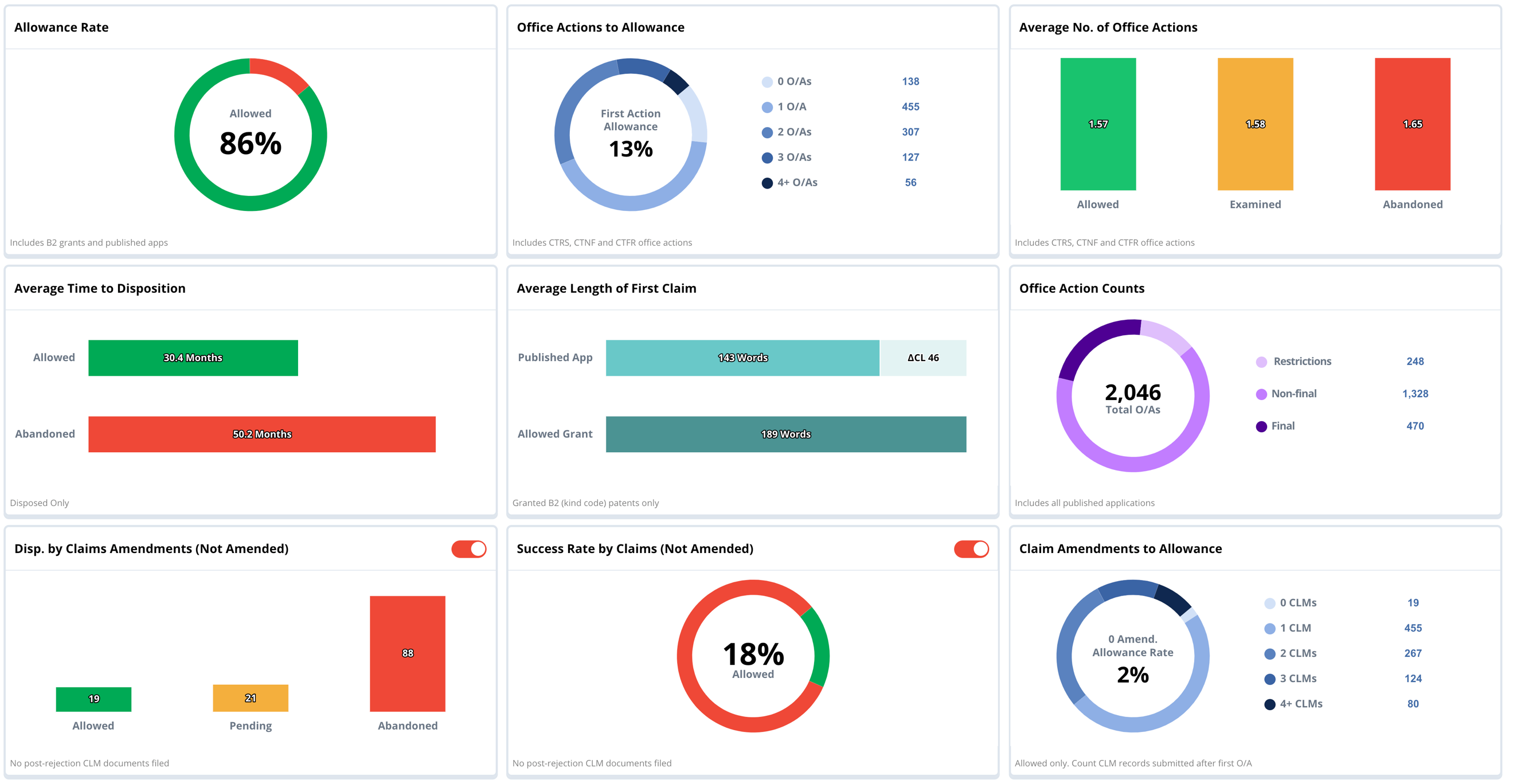
An example of the filters is shown the next section. In each example below, we’ll look at the statistics for the examiner, Jonathan Hurst. Filtering allows you to view comparative analytics between the examiner (shown in these examples) and at other levels of abstraction. For example, you may want to compare the overall statistics of the Art Unit to the specific examiner.
Understanding total number of applications examined by current status with an Overview
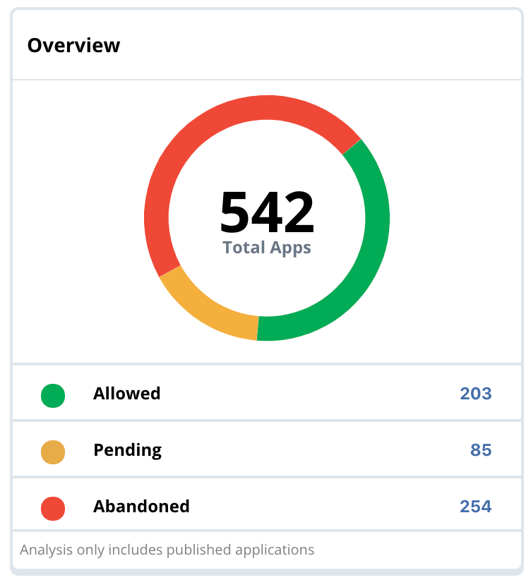
An Overview shows the total number of applications examined and further divides them by the current status of the application. In some cases, such charts are drillable. For example, clicking on the yellow arc, you can view the 85 applications currently the examiner’s backlog.
Understanding history and backlog trends: Applications by File Date
Applications by File Date shows the same data as in the Overview card with a longitudinal view of the data to get a better understanding of the backlog in terms of when the matters were filed. By viewing the red and green bars, you can determine if allowance rate is trending up or down. It is also easy to note that he has been prosecuting applications since 2003.
How likely is it to grant? Understanding Allowance Rate
Allowance Rate data show the overall allowance rate for Mr. Hurst’s entire career. It is easy to compare his allowance rate of 44% to that of the Art Unit as a whole at 64%, and easily recognize that he is a tough examiner compared to his colleagues.
The note at the bottom of the card indicates that this rate included disposed applications only. In other words, the 85 pending applications on his docket are not included in the 44% calculation.
How many office actions is this examiner is likely to give before allowance? Understanding Office Actions to Allowance
Office Actions to Allowance counts the total number of restrictions, non-final and final office actions prior to granting an application. These data suggest that claims will likely have to be significantly narrowed prior to grant.
Additional perspectives on average Number of Office Actions for Allowed, Granted, and Abandoned Applications
Understanding Average Number of Office Actions provides another point of view. Those patents that were allowed took an average of 2.76 office actions prior to grant, whereas prior to abandoning an application, applications historically required more office actions at 3.05 per abandoned application.
How long will it take to grant? Understanding Average Time to Disposition
Average Time to Disposition indicates the number of months required before an application is either granted or abandoned.
How can I keep my claims broad? How much am I going to need to narrow my claims? Isnt’ this very similar to the 1st question. Do we need both? Using Delta CL to analyze change in Claim Length – Average Length of First Claim
Analytics regarding Average Length of First Claim commonly include Delta-CL (Change in claim length) which anticipates the degree to which claims will need to be narrowed prior to grant.
What are the odds of receiving a restriction, non-final, or Final Office action? Viewing Office Action Counts (by type)
Looking at office actions by their type helps you learn how often you might receive a restriction rather than a more typical non-final or final office action.
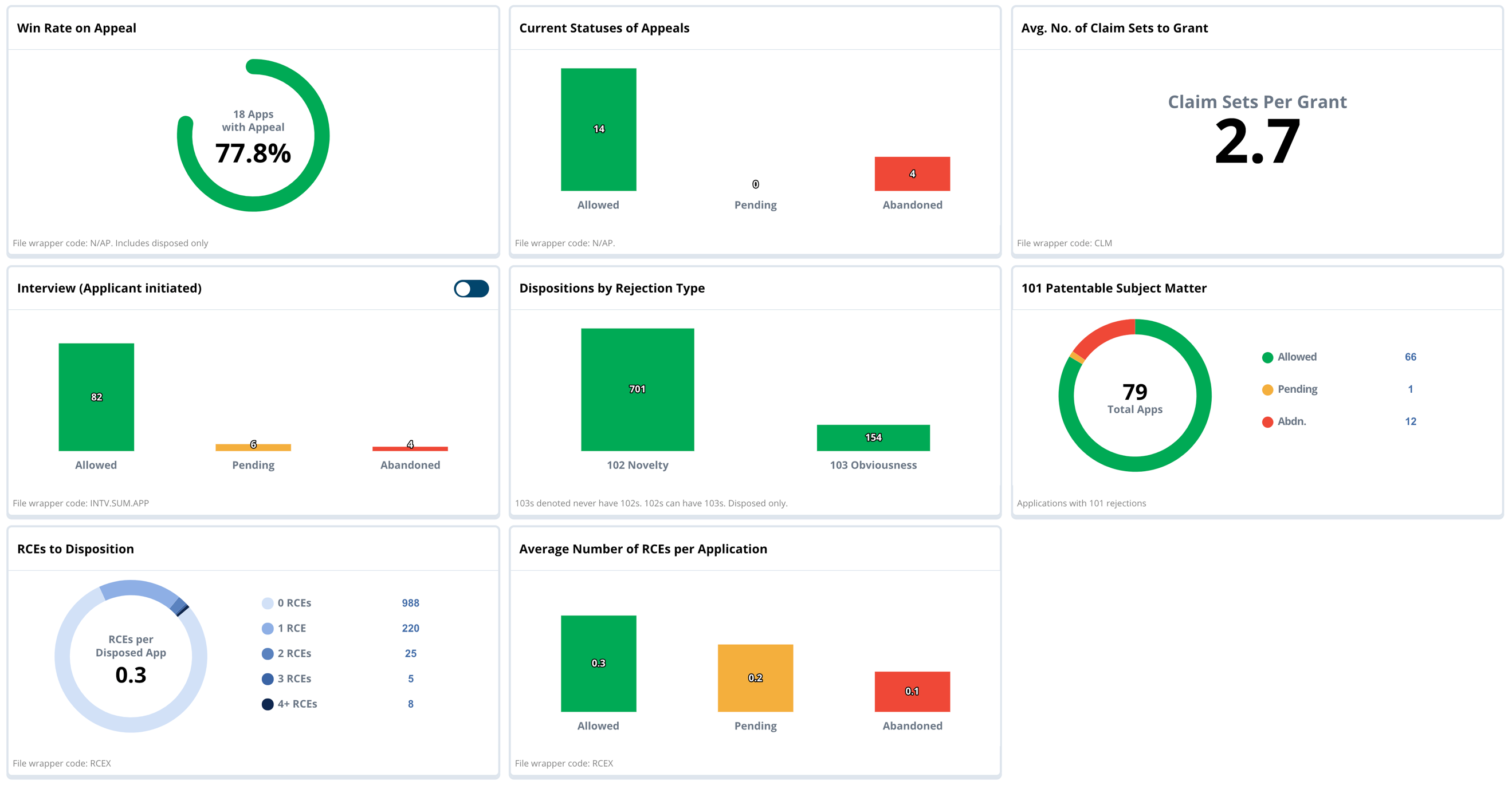
You’ve received a rejection. Is an appeal a good strategy? Measuring Win Rate on Appeal
The Win Rate on Appeal data helps you determine if an appeal is a good strategy during your examination.
How can you prepare for a successful Appeal? Viewing and drilling into Current Status of Appeals
Navigating Current Statuses of Appeals helps applicants to find specific examples successful appeals vs. unsuccessful appeals, in some cases enabling applicants to drill into and view the file wrapper documents.
How much will I modify my claims prior to Grant? Average Number of Claims Sets to Grant
Each time an applicant modifies claims, they file a new CLM document. Understanding Claim Sets to Grant helps to quantify how much you can expect to be modifying your claims prior to receiving a notice of allowance.
Condensing Prosecution and Keeping a Cleaner Record: Examiner-Initiated Interviews and Applicant-Initiated Interviews
Interview data tells you about possible outcomes when the examiner initiates an interview, and also whether it may be a good strategy to initiate an interview. Interviews can condense prosecution, keep the record cleaner, and give applicants multiple attempts to negotiate the claim scope.
Understanding 102 Novelty and 103 Obviousness Rejections using Dispositions by Rejection Type
Dispositions by Rejection Type data identify successful allowances after having received a 102 (novelty) rejection or a 103 (obviousness) rejection. You can view the applications that successfully overcame either type of rejection to help guide how you might respond to your office action.
What are the odds of receiving a 101 Patentable Subject Matter rejections?
101 Patentable Subject Matter data disclose the number of applications that received a 101 rejection as well as the current status of those applications. The doughnut chart indicates about a 50/50 chance of receiving an allowance after a 101 which is better than Mr. Hurst’s overall allowance rate.
How can I develop a successful strategy fo responding to 101 Patentable Subject Matter Rejections?
Applicants can use charts and filters to identify the most relevant examples, then drill into the File Wrapper to research specific successful and unsuccessful examples in depth. Some analytics platforms support drilling through directly to application details including the File Wrapper.
Is filing an RCE likely to be a successful strategy? Charting RCEs to Disposition
RCEs to Disposition charts display the number of Requests for Continued Examinations done prior to the applications being disposed (either abandoned or granted). Some applicants can drill into any of these numbers to view which were ultimately successful and which were not.
Considering filing (another) RCE? Understanding when it is time to cut bait and abandon an ongoing prosecution by understanding Average Number of RCEs per Application
Data regarding Average Number of RCEs per Application provide additional details into potential success when filing RCEs. As with other charts, Applicants can generally drill in to find examples of successful applications after an RCE is filed.
How can I understand the success over time of assignees, inventors, agents, and even portfolios?
Advanced Patent Prosecution Analytics leverage the ability to chart and filter large sets of patents by prosecution status to characterize the success over time of assignees, inventors, agents, and even portfolios. Essentially, any set of patents and applications can be split into three unique series.
- Granted (any filing that was granted no matter the current status of the grant)
- Pending (applications that are currently active)
- Abandoned (applications that were abandoned prior to grant)
Every matter filed with the USPTO must be in only one of these three states today. It can be important to deduplicate the data set and ensure that each matter filed is represented by only one document that represents the current state of the filing/matter.
Splitting Charts by Prosecution Status of the Patents
The heart of Advanced Prosecution Analytics is the ability to split any set of patents by US Prosecution Status. Essentially, this divides the set of documents you chart into three different series comprising the following:
- US Grants (both active, and abandoned post-grant)
- US Pending Apps
- US Abandoned Applications (abandoned during prosecution)
Which charts benefit most from Prosecution Status?
These are the most common single dimension charts that are enhanced to support prosecution status splits:
- Chart by Assignee
- Chart by Inventor
- Chart by Agent
- Chart by Examiner
- Chart by Date
- Chart by Class
- Chart by Art Unit
Below we will run through some specific examples and provide a discussion of the type of insights each chart provides.
Why We Picked Google for These Analyses
Before we get started, we wanted to take a moment to explain why we picked Google to illustrate these examples.
- It is a big portfolio that can show almost any use case we need.
- We generally don’t find data that indicates too much negative in their portfolio. Our objective is to illustrate using good examples, and not call out any particular company.
However, we encourage you to look at your own portfolio and those of your key competitors using these same metrics and splits. You will often find insights in your own portfolio that are not apparent in Google’s portfolio.
Keep in mind, however, that these statistics represent only one dimension of a complex multivariate analysis. Consider for example two law firms, one with a higher allowance rate than another. While it could be that one firm is more effective than the other. It is just as likely that another variable is causing the issue, such as filing different technologies with wildly different allowance rates in the different art units.
It’s up to Applicants to use these tools prudently. Big data gives you all the tools required to boil the ocean of patents and bring quantitative data when evaluating the performance of your law firms, or your company vs. your top competitors.
In the rest of this article we provide explicit examples showing various splits from the different charts.
Understanding comparative volume and allowance rate of top applicants in an Art Unit
The chart above shows all US published patent filings in art unit 2657, and provides the following insights.
- Comparative volume of patent filings between a range of top applicants (with the caveat below)
- Ability to infer allowance rate by comparing the size of the allowed patents (green bar) and the abandoned applications (red bar).
- Number of pending applications represented in the set, which allows you to infer the current level of interest in this technology.
This variant of the Chart by Assignee includes a clause and limits the analysis to US grants of Kind Code B2 (i.e. excludes B1 grants) in order to better reflect the overall allowance rate (ratio of the green to the red bars).
Why does Prosecution Analytics not Consider B1 Grants?
Applications that take the B1 route (applications are not published except rarely after the notice of allowance is given), overstate the inferred allowance rate. For example, here you can see that Google has 172 allowed B2 grants in Art Unit 2657. However, Google has a total of 296 grants when you include B1 grants. But remember, B1s don’t have corresponding published applications, and as a result, we can’t know if an application taking the B1 route was ever abandoned, and therefore the ratio of granted to abandoned matters would be too high if we included the B1.
You may also notice that on the Prosecution Analytics Report, the allowance rated is presented with a footnote explaining that the chart is derived from “B2 grants and published applications.”
By way of background, since 2001, only about 9.8% of US grants have been published as B1s, however certain applicants choose to use the B1 route far more often than others do. For example, in the same time frame, Google, Inc, used the B1 route 45.2 percent of the time based on the number of published grants attributed to Google. From public data, we have no way of knowing how many B1s were filed and subsequently abandoned, therefore we exclude them when doing allowance rate calculations.
How to determine the overall potential for success based on inventors? Chart total filing activity by top inventors, backlog, and allowance rate
In this example we searched on Google’s entire US portfolio (excluding B1 grants) and charted by inventor, then split the chart by “Prosecution Status” in the “Split by” refinement option.
Similar to all the prosecution charts you gain insight into the following areas:
- Total filing activity by top inventors (total of all bars)
- Current backlog of applications (yellow bar)
- Implied allowance rate (ratio of green to red bars)
A chart like this or similar analytic is often used by portfolio managers and filing committees to determine the overall potential for success based on the inventors. Clearly, it is not a definitive signal, but it can be used as a tie breaker in some cases. Some patent committee members consider the datapoint “just good to know,” since on occasion you’ll find an inventor with a very low success rate, and this fact may impact your decision to file or not.
Which law firm will be most successful my application? Using Prosecution Analytics to Find the Best Law Firm for the Prosecution
One of the most powerful use cases for Prosecution Status splits is the chart by Agent split.
Similar to all the splits, users get a clear view of:
- Total level of activity by that agent
- Number of currently open matters (yellow bar)
- Inferred allowance rate (compare green to red bar)
Everyone benefits when applicants use hard data to select the best law firms to partner with to prosecute a patent application.
For Patent Owners
Patent owners use this chart to as one measure to quantitatively evaluate their stable of law firms. To be fair, it is only one datapoint. Sometimes there are legitimate reasons that one firm would have an allowance rate higher or lower than another. As you will see, the technology (class or art unit) will greatly influence an allowance rate of an invention. Therefore, agents working in easier art units will most likely have higher allowance rates.
For Law Firms
Law firms use this same chart as a market development and business development tool. If they want to ask for some of Google’s prosecution business, it allows them to come armed with data to support why they believe they can do a better job than one of their incumbent firms.
Understanding Allowance Rate by Examiner with Prosecution Analytics
Splitting the Chart by Examiner by Prosecution Status is one of the most useful views for the patent practitioner. In this example, we limited the analysis to just those patents in art unit 2657 to get a fair relative comparison.
You’ll notice that the allowance rate by examiner can vary significantly, as can an individual’s backlog of matters currently in active prosecution.
Occasionally, you’ll see one examiner who has huge backlog (in yellow) compared to other examiners in the art unit. It is our experience that these examiners tend to be a team lead where applications are initially assigned to a lead examiner who subsequently reassigns them to other examiners in the art unit based on technical skills and backlog of each examiner.
Understanding trends by using Chart by Filed Date
When you split a date chart, we recommend you use file date since patents filed on a particular date tend to reflect the regime in which they were created in terms of the set of law firms, the portfolio objectives, the philosophy of the Chief Patent Counsel, budgets, and other factors that can change over time.
Notice that the backlog represented in Yellow has a reverse-triangle shape since the number of pending applications naturally goes down over time.
You’ll also notice that the number of filings in recent years usually appears to be going down, which is mostly due to publication delay from the PTO. In other words, not many applications filed in the current year would have been published yet, therefore giving you the appearance that the number of filings is declining.
High Variance between Art Units can be seen with Chart by Class/Art Unit
The same splits are available on all of the Class charts and the Art Unit chart. In this article I illustrate Art Unit because the USPTO’s examination core is broken down into Art Units, therefore this gives a good illustration of differences between art units.
As with the other charts the Prosecution Status split gives you an indication of the total volume, the backlog, and allowance rate.
You’ll notice that the allowance rates (ratio of green to red bars) can vary greatly between art units. Consider the first two columns on this chart. Art unit 3711 (games and amusement) is about four times easier to get a grant than 2853 (printing)
A chart such as this gives you an indication of what you are dealing with. There are times that patent attorneys use the allowance rates by art unit to try to target their patents to similar or related art units with a better allowance rate.
A chart such as this gives you a comparative analysis across a series of art units on the three main metrics the chart exposes. For a detailed view of a specific art unit, applicants can use the Prosecution Analysis Report described at the top of this page.
Conclusion
Using basic Prosecution Analytics to inform specific decisions on individual matters and decisions can condense prosecution and result in stronger patents. Splitting your charts by Prosecution Status is a good way to view matter status across a range of dates, assignees, art unit and others. The data provided helps law firms and patent owners better understand the file to grant rates of any set of patents, and can be used together to build certain data-driven conclusions about your patent portfolio, or any portfolio you choose to analyze.
Isn’t it cheating the system to use Prosecution Analytics?
In a time of scarce resources, it’s sound practice to avoid relying on anecdotal knowledge and supposition. This research is no different from how careful litigation researchers understand the history, tendencies, and current docket of a judge who will hear a case.
It’s easy to use patent prosecution analytics to develop a data-driven prosecution strategy designed to get the broadest claims allowed as quickly as possible.